Styling beautiful spaces can make a huge impact in your home? But – sometimes it can be tough to know where to start! I am sharing a few tips on how to style a vignette – and I promise – it isn’t hard at all.
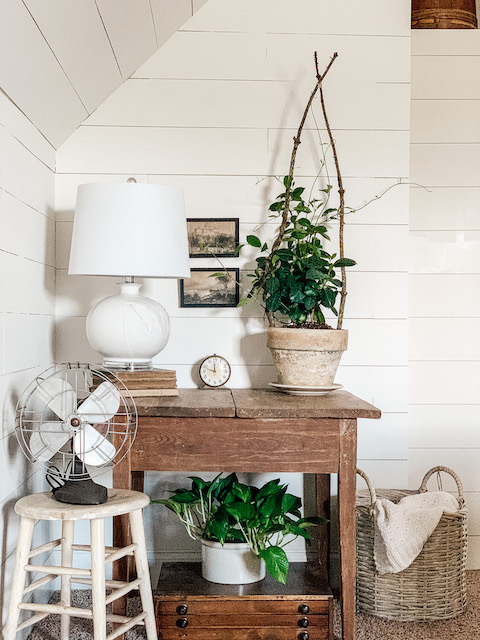
We all want beautiful and inviting spaces in and around our homes. Among other things, vignettes can help us to achieve that! Purposeful vignettes can help to make our homes seem more polished and put together. But – knowing HOW to style the pieces you love “wisely” can be hard! Below I am sharing how to style a vignette in just a few easy steps! Whether working a table top or a fireplace mantle, these tips will help!
Design Principles
Before we jump in, I felt that it would be good to review the principles of design. I use these as guidelines when working in any space – big or small. I find that these principles will help me to organize the creative process in my head. They give me a starting point and a roadmap – so to speak! It is important to note that these principals can overlap and work together to help form a meaningful and pleasing space. They are:
- Proportion: the relationship between objects
- Scale: the size of an object relative to the objects that surround it
- Balance: the use of different pieces to create a sense of steadiness
- Harmony: the pleasing arrangement of all the items in a vignette
- Unity and Variety: the use of items that are both similar in characteristics and also varied for interest
- Rhythm: the repetition of elements in a space which helps to provide visual unity
- Emphasis: the idea of having a dominant item in a vignette
While these principles can seem a little overwhelming to read at first, they really aren’t too hard to understand at all. With these ideas in mind, below I am sharing some practical tips on how to style a vignette with intention.
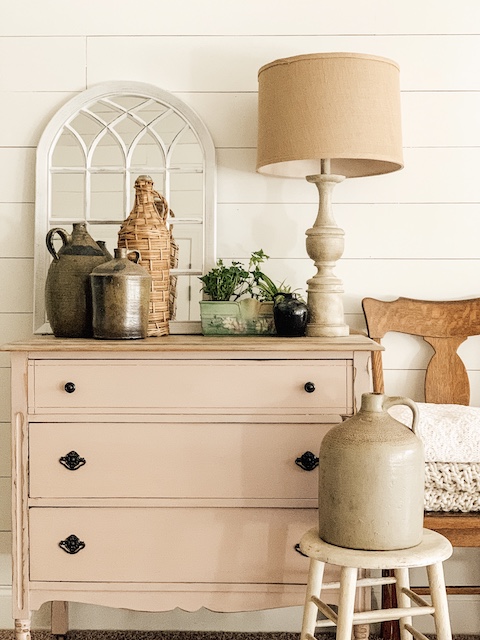
Decide On Your Theme
This is always my first step. I find that identifying a theme for my vignette helps me to stay organized while I am choosing the items that I will use. The theme helps me to create a vision and helps to give me some direction. I like to base my styling around themes such as seasons, holidays, specific colors, individual objects, or even the feel of a room. Most importantly, my main goal when choosing a theme is to support the style of the entire room that it will be living in.
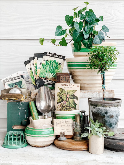
Gather Your Items
While I know this sounds elementary, I find it to be such a helpful part of the process. Regardless if I am working with modern lamps or vintage crocks, I will gather up all of the pieces that I want to use in a space and I will lay them out on the floor or on a table so that I can see all of the pieces. When I can see what I am working with, it helps to make the process move along more easily.
QUICK TIP: Usually, before I gather my items, I like to quickly analyze the space that I will be working in. And, when possible, I like to clean off the area completely. Beginning with a clean and blank slate allows me to create a vignette more freely.
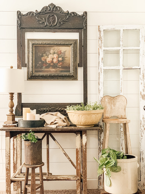
Styling Your Vignette: Layers & Interest
Whether you are working with a few items or many, it is important to remember a few helpful things while styling your vignettes. Here are some practical tips that will help you to ‘style’ with confidence.
Vary Height
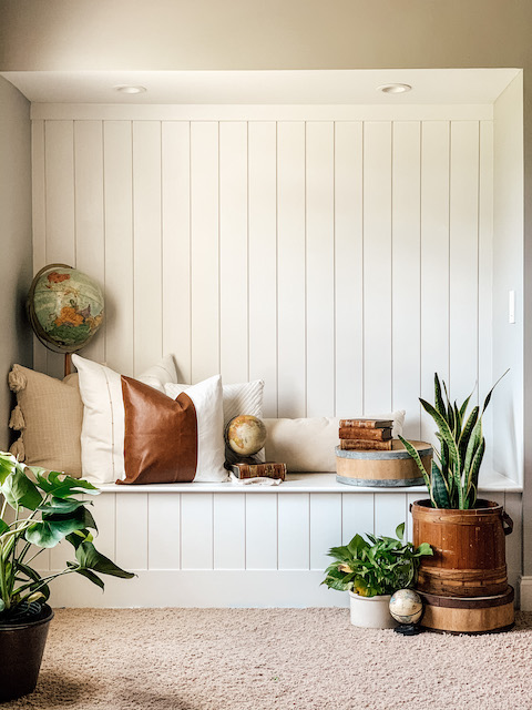
Vary the height of your items. If you are using many things that are the same height then use things like books or a box to stack items up and to create more visual interest. This will help to break up the monotony of the items. I like to choose one item to be the ‘tallest’ and work down from there – in a triangle shape.
QUICK TIP: I often use totally random things to give my vignettes height. For example, I have been known to stuff an old kitchen rag in between bowls to make the stack them taller. I have used old socks and crumbled up paper to raise up items when I am stacking them. I will use just about anything to add height if I feel the vignette needs it.
Create Depth
Something as easy as shuffling pieces to the front (and back) of a vignette can easily add interest to your space. You do not want all of your items to simply be placed in a straight line. Staggering your items is always a good thing to do. Adding contrasting shapes will also help to add depth to your vignette.
QUICK TIP: You want to ensure that the entire space has a sense of overall balance and that you are distributing the visual weight of all the items equally.
Vary the Texture
Mixing up the textures in a space can really make a vignette come to life. You can mix metals, textiles, woods, glass , greenery and so on. And, when done right, mixing textures creates a real sense of interest and keeps the eye engaged!
QUICK TIP: I have found, that when ever my vignette just seems a little off, adding a small piece of nature – whether it is a small plant, a rock, a feather – helps to bring the vignette to life. I share more easy ways to implement touches of nature here.
Odd Numbers
I love to use ‘like items’ in a vignette but when I do I usually aim to use 3 or 5 of them. I find the odd number creates an immediate sense of symmetry and symmetry helps to anchor a space.
Step Back And Edit
You may need to spend a few moments analyzing your vignette to make sure nothing is out of place. I like to step back and look at the space from several angles and make small tweaks to the vignette as needed. Also, as you may have noticed on my Instagram Feed, I love to take pictures of my vignettes. This is a great way to ‘step back’ and analyze your vignette.

Wrap Up
I once read, “The home should be the treasure chest of living.” I love that sentence. I feel we should fill our ‘treasure chests’ full of the things we love. Whether you are drawn to vintage or modern or a mix of both, filling your home with the things that bring you joy is important! Stying those things mindfully and with intention will help to create a space that is inviting and desirable. My hope is that learning how to style a vignette will help you to achieve just that – an inviting space that you LOVE!
 Nostalgic Santa Display
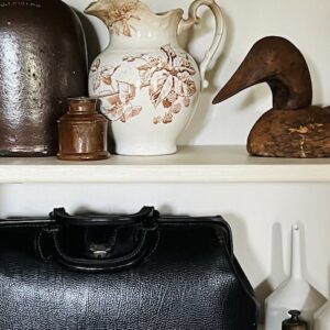 The Best Vintage Leaf Finds For Fall
 Organizing A Vignette By Color – With Country Sampler Magazine
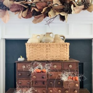 Easy Fall Mantel


Goodness! You are so good at vignettes! So inspiring as always! Thank you Emily!!