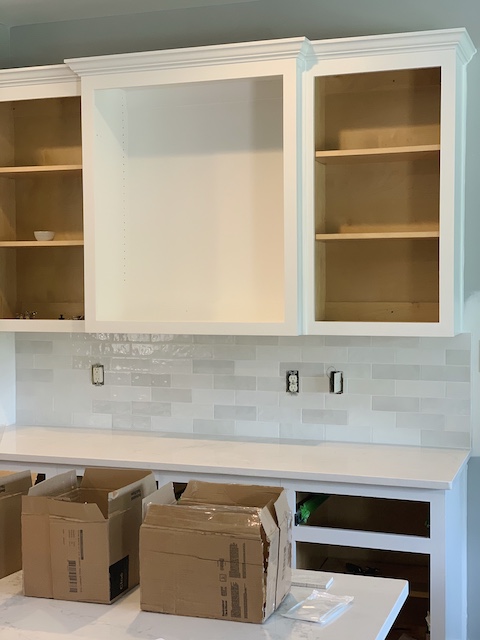
I am sharing all of the details behind our new kitchen tile backsplash. Come see what we chose and why we chose it! I am totally in love with the tile we went with.
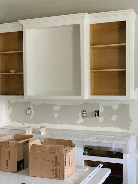
As you may know by now, we are in the midst of a kitchen remodel and I wanted to give you an update on the tile that we decided to go with. A few weeks back, our entire family took a trip out to a local tile store to pick up the tile I had originally wanted. (You can read all about that excursion here.) Unfortunately, they only had about 35 pieces of the tile that we decided on in stock and I was told that I would simply need to order the amount that I needed online. So, I bought 5 little squares to take home to ‘test out’ and I went on home to place my order. I was sure when I left that this was going to be our new kitchen tile backsplash.
When I got home and played around with the square tiles I decided that I didn’t love it. After studying it, I decided that I loved everything about it except the shape and size. I really loved the color, the gloss, the waviness of the tiles – but something just wasn’t right. Then, a lightbulb went off in my head and I realized exactly what it was that was throwing me off. It was the shape and size. The shape and size of the new tile is exactly the same as the tile that I had in the kitchen before – I wanted something totally different. I went back to the internet to look for something new.
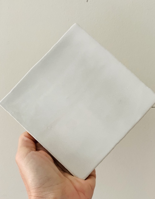
This was the exact tile I brought home 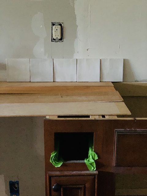
I didn’t love it at all. 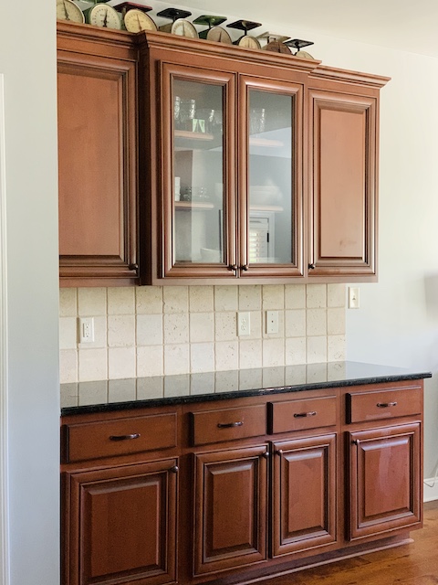
It reminded me too much of what we had there originally and I wanted a change!
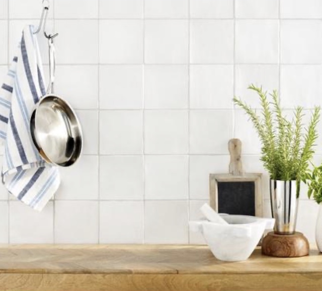
After a little searching online, I quickly decided on a new tile that I was sure would work and as soon as I saw it. As they say, it was love and first sight and I knew it was ‘the one.’ (This was the inspiration photo that I found on Pintrest that had me hooked!) This tile had all the same features of the square tile that I had originally wanted (wavy, gloss finish, etc..) but the shape was rectangle instead of square. Once I realized what I wanted I began my online hunt to try and find it.
After a little digging, I learned that they carried a version of THE TILE that I loved at Lows. It is from the manufacturer, Bedrosians. I was so happy to find it but, sadly they were currently out of stock at Lows- sigh! I did a quick google search to find that there was a Bedrosians website and there I found the exact tile I wanted – Cloe 2.5″ x 8″ Ceramic Tile in White.
.
Let me give you a little info on this tile. The Cloe Collection is a glazed ceramic wall tile that has a smooth gloss finish and what I loved most about the tile is that once you choose the color you want there will be variations in hues and tones within that color choice. So, for example, we chose to go with white and within our boxes of tile there are about four or five different hues of white that all blend together perfectly. That variation in the hues create subtle interest and blend nicely with the quart counters that we chose. (You can read all about our counters right here.)
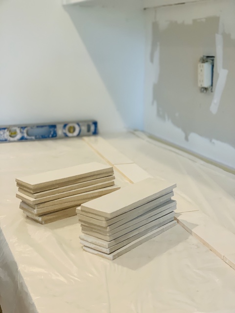
I want to share a few things that I discovered while helping our contractor work with the Bedrosians tile.
No. 1 – Play Around With The Hues
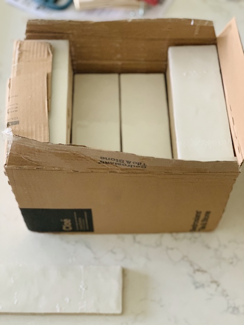
Before our contractor began hanging the tile, I went through the boxes and examined all of the hues. I did not want an organized color pattern at all so I just made sure to shuffle them all up a bit. My basic goal here was to make sure that we mixed and matched the variations of the color well so that there weren’t any big clumps of a single color on the wall in one spot.
No. 2 – Level Things Out
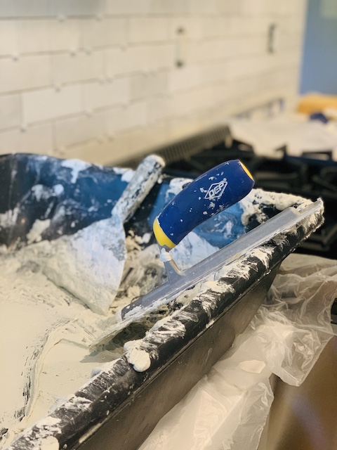
After careful inspection, our contractor determined that one of the walls that were were tiling was warped and uneven. In addition to that, the hand made tiles are all a bit different, not only in color, but also in size and shape. Because they are hand made and are ‘wavy,’ they don’t all sit flush with the wall. Basically, they are all a bit uneven on the backside. While not at all unmanageable, this did make it a bit more difficult for our contractor. He used thin-set mortar for this project and he had to add more mortar in some places to make sure each tile was at a uniformed and even distance off the wall. It has been a slow process, adding each tile on at a time.
No. 3 – Rough Around The Edges
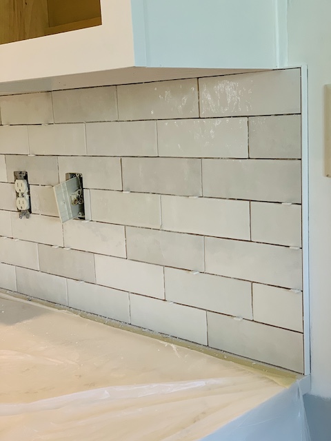
We tiled in two areas in our kitchen and both of those spots required that we use some kind of border. I looked at all of my options and decided to use a schluter. A schluter is simply a little strip of trim that is used to create a clean edge around any exposed tile edges. There are a lot of schluter options out there but I chose a white PVC schluter that was straight. I wanted a very minimal edge around the tile. I basically wanted it to look like there was no edge. I could have bought edging that coordinated specifically with the tile that I chose – but I wanted the edge to disappear – not stand out!
No. 4 – Choose A Grout
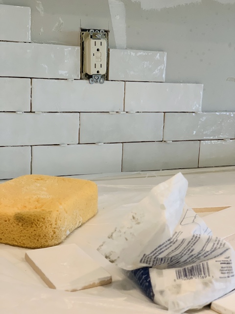
I was torn with this choice but in the end we decided to go with a grout in the color Artic White. I told my contractor that I wanted a very small grout line. We talked about it and he was clear that he would go as small as he could for the grout line, but because the tiles were uneven there would be visible grout lines. So far, I am thrilled with how the grout looks with the tile!
Wrap Up
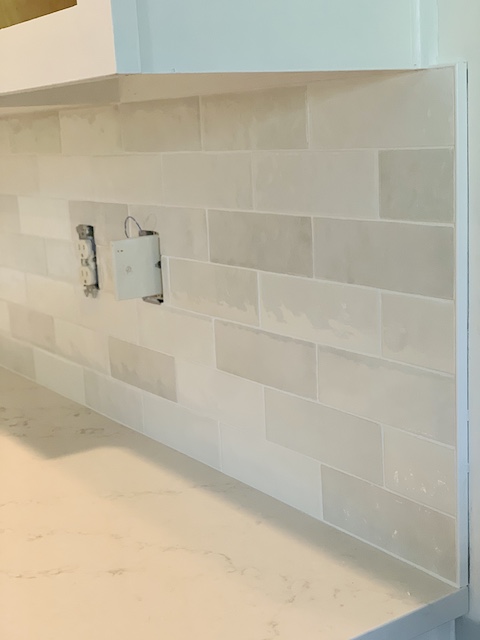
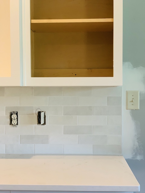
I am so excited with the recent progress in our kitchen. We are not done tiling the entire kitchen area yet, but with one wall completely finished, I felt that I could give you my honest feedback on our new kitchen tile backsplash! We love it – and we feel that it really ties in well with our existing appliances and with the colors that we have in our home. Let me confess, my husband and I are so glad that we did not try this ourselves. We have done many DIYs in our home (see one our most recent ones here), but the wavy character of the tile that I chose really made me nervous and I knew our contractor could handle it. In his own words (when I showed him the tile – and the vent hood for that matter), “I like a challenge.” I can not wait to share the completed kitchen – stay tuned!
*this post contains affiliate links

 Simple Dollar Tree Ghost Transformation
 How To Build A Birdhouse With Scrap Wood
 Top 5 Blog Posts Of 2021: Fridays At 5:00
 Vintage Planter Collection: A Turquoise Vignette


[…] about our new counters (click here to read all about those) and all about our new backsplash (click here to read all about that) and so on … but I feel that the painting the dark kitchen cabinets maybe made the biggest […]